Mobile App Design Trends That Actually Matter in 2026
Most "trend" articles are visual fluff. Here are the mobile app design directions in 2026 that actually move retention, engagement, and revenue, backed by what we see shipping.
Every January the design press publishes the same article: "20 mobile app design trends for [year]." Most of them are visual fads, neumorphism, glassmorphism, gradient meshes, that look fresh for six months and dated for the next ten years.
This isn't that article. These are the mobile app design directions in 2026 that we're seeing actually move metrics, retention, conversion, time-on-task, based on apps shipping in the wild and the patterns top product teams are converging on.
1. Spatial design comes to phones
With Vision Pro maturing and Android XR shipping, spatial design language is leaking into 2D mobile interfaces. Layered depth, soft shadows, and motion that suggests three-dimensional space are showing up in apps that previously stuck to flat design.
This isn't just aesthetic, it improves perceived hierarchy, reduces visual noise, and makes complex interfaces easier to scan. The trick is restraint: heavy-handed depth feels skeuomorphic; subtle depth feels modern.
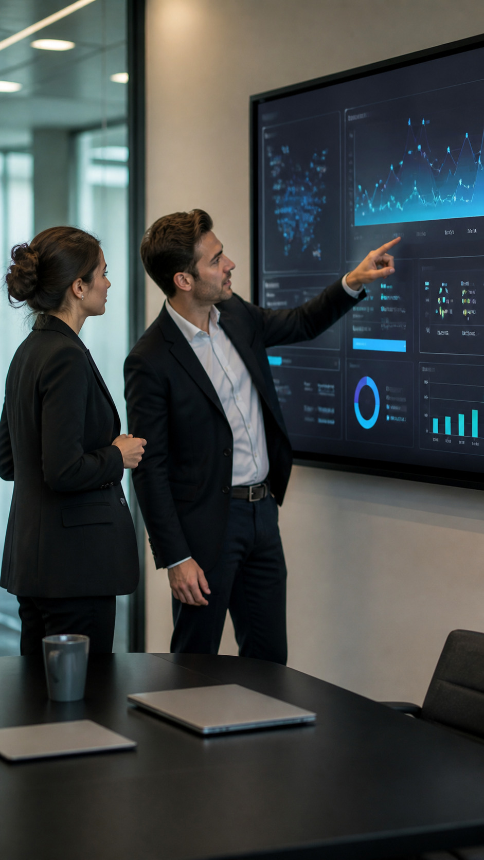
2. Conversational interfaces as primary navigation
AI-driven chat is replacing traditional navigation in a growing class of apps, particularly productivity, finance, and customer service. Instead of "find the right screen for what I want to do," users describe the action and the app handles it.
This pattern works when the underlying AI is reliable and fast. When it's slow or wrong, it's worse than traditional navigation. Apps shipping conversational primary navigation in 2026 invest heavily in latency, fallback patterns, and clear undo behaviors.
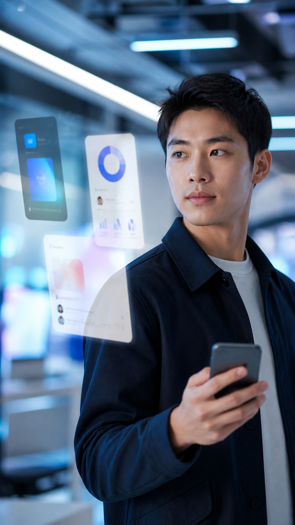
3. Predictive UI
Apps are getting better at anticipating what users want next. The home screen surfaces likely actions; forms pre-fill probable values; notifications group intelligently rather than firing at every event.
The design challenge is calibrating confidence. Predictions that are right feel magical; predictions that are wrong feel intrusive. Top apps in 2026 expose the prediction logic ("Suggested for you") so users understand why they're seeing what they're seeing.
4. Gesture-first interactions
Tap-and-button interfaces are giving way to gesture-driven flows: swipe to dismiss, drag to organize, long-press to multi-select. iOS and Android have normalized gesture vocabulary, and users (especially under 30) expect richer gesture support than buttons alone.
The risk is discoverability. Gestures that aren't discoverable get used by 5% of users. The pattern that works: gestures as power-user shortcuts, with traditional button equivalents as the discoverable baseline.
5. Personalized themes (real ones, not just dark mode)
Dark mode is table stakes. The 2026 evolution is deeper personalization, accent colors derived from user-uploaded photos (Material You), seasonal theme variants, and accessibility-driven custom themes that go beyond pre-defined options.
This requires design systems built around tokens, semantic color variables that flex across themes, rather than hard-coded colors. Apps without that foundation can't play in this space.
6. Soft motion as primary feedback
Hard transitions and sharp animations are out. Soft, spring-based motion is the dominant feedback pattern in well-designed apps: nothing snaps, everything settles. The result feels alive, considered, and premium.
The technical lift is real, implementing spring physics across all interactions takes engineering investment, but the perceived quality lift is bigger. Apps shipping precise spring animation feel one tier above competitors using default ease-in-out curves.
7. On-device AI for instant feedback
Server-roundtrip AI feels slow on phones. Apps doing the work on-device feel snappy. With Apple Intelligence and Android's on-device Gemini Nano, more AI tasks are running locally, generating text suggestions, transcribing audio, summarizing content, all without a network call.
For designers, this changes the constraint set: features that previously required loading states can now feel instant. UX patterns built around server latency need to be rethought.
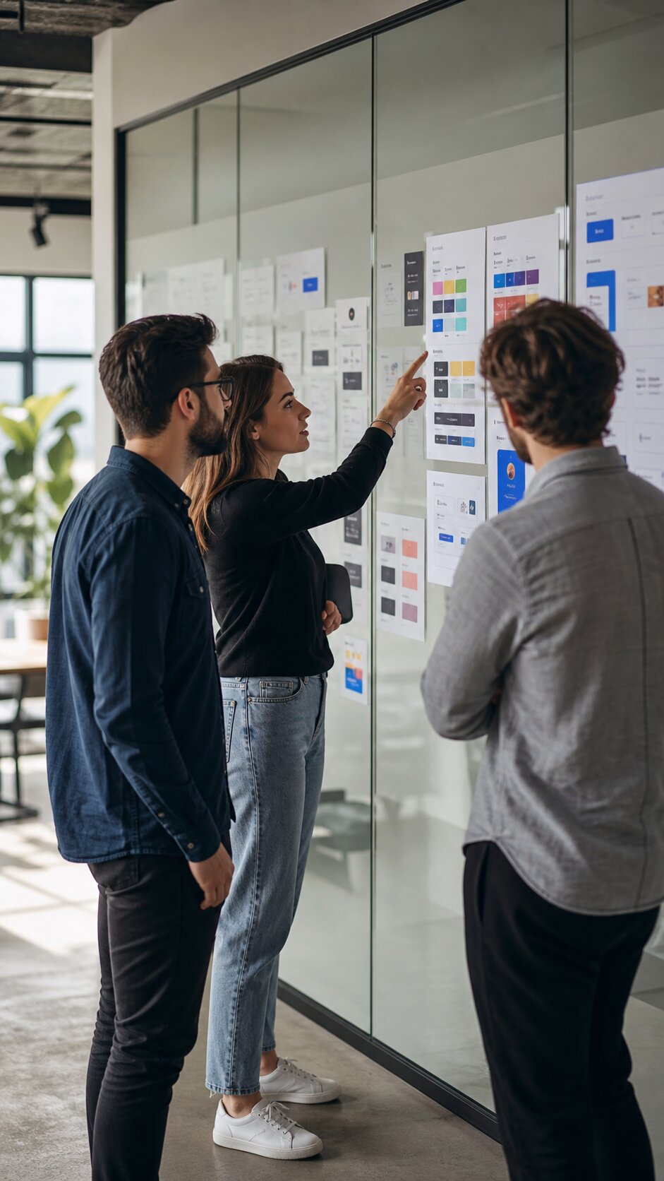
8. Fewer screens, denser content
The trend toward minimalism peaked in 2023. The pendulum is swinging back toward denser, more information-rich interfaces, particularly for productivity and B2B apps where users want to see more in less.
The key is information design, not ornament. Dense interfaces work when hierarchy is clear, typography is precise, and color is used sparingly. They fail when designers confuse density with clutter.
9. Accessibility as a design pillar
Accessibility moved from compliance afterthought to design priority. Top apps now ship with proper screen reader support, dynamic type that scales without breaking layouts, sufficient color contrast at every state, and motor-accessibility considerations for interactions.
This is partly regulatory pressure (Europe's EAA went into effect in 2025) and partly market pressure (apps that exclude users get reviewed accordingly). Accessibility-first design is no longer optional for serious apps.
10. Privacy-respecting UX
Tracking-heavy onboarding and aggressive permission prompts are dying. Apps in 2026 ask for permissions contextually, when the user actually tries to use the feature, and explain why in plain language.
This is partly Apple's ATT framework forcing the change, and partly users learning to push back. Apps that respect privacy in their UX patterns convert better, get better reviews, and retain users longer.
What to ignore
A few "trends" that are mostly noise in 2026:
- Brutalist design, keeps cycling through every five years; works for niche brands, fails for mass-market apps.
- Heavy 3D in non-gaming apps, performance cost rarely justifies the visual payoff.
- "AI features" without clear user value, slapping a star icon next to "AI-powered" doesn't make a feature useful.
The takeaway
Trends that compound, better motion, deeper personalization, accessibility, on-device AI, are about giving users more capability with less friction. Trends that are visual fads are about looking different for the sake of looking different.
If you're building an app in 2026 and want help thinking through which patterns make sense for your users, we're happy to talk it through.